Despite the popular wisdom being “don’t judge a book by its cover,” humans are visual creatures. Whether consciously or subconsciously, we’re highly influenced by beauty and aesthetics, and wine whether the bottle, or architecture, is no different. A great wine label will always stand out, even in a crowded wine aisle. For Boutinot Wines, the company behind several of WineCollective’s favourites, the wine label has become an important vehicle for visual storytelling. Jenny Hickman, creative manager, and Julie Ruiz, international product manager, give us a glimpse into the design process.
Can you tell us a bit about the visual storytelling that Boutinot Wines does via its labels? What’s the process and what are some of the challenges?
Jenny Hickman (JH): “Our in-house design team and our partner designers all understand the core message of Boutinot – great quality wine at an accessible price – and we work hard to make sure the design and dry goods choices reflect that message, whether it’s a bright, bold and modern label or a contemporary take on a classic.
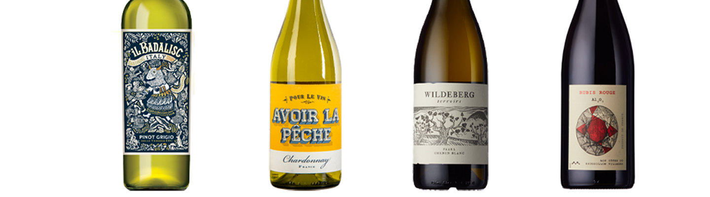
Boutinot has amazing, long-standing relationships with our producers, but we’re not just importers, we’re growers and winemakers in our own right. This gives our creative team real access, not only to the wine information and thought process behind it but also to the regions where the grapes are grown, all from the people who actually live and work there. For example, we’ve recently redesigned our Il Badalisc wine. The design is now a true reflection of the legend and the real-life festival that goes with it.
At Boutinot we’re lucky enough to sell wine all over the world. With that comes the need to understand the different cultures and attitudes of our audiences and how they may interpret our designs. The creative team also gets to work closely with our fantastic sales divisions to ensure our thoughts and designs translate to our customers and consumers.”
What do you keep in mind when you’re designing for different types of wine?
Julie Ruiz (JR): “I think the key is to nail down what it is about a particular wine that you want to convey. What part of the story makes it really unique? The wines we make are so delicious, that you want to reflect on how great it tastes. The challenge is, how do you say that? Some wines are about more obscure places that you want people to discover, so you need to insist on that by making the region more prominent or finding other ways. For instance, when it came to “Avoir la Pêche”, it was all about a very good Chardonnay from France and not overthinking it. It tastes like peaches, it’s vibrant, so we thought: let’s be a bit cheeky with a French expression [translating as “feeling in top form”] and have some fun! Another example would be Wildeberg or Alo, two projects that truly focus on regional provenance and taking cues from the environments the wines are from: a wild South African landscape or a little jewel from a rocky soil in the Languedoc.”
Avoir La Pêche is a WineCollective favourite.
What’s your favourite part of the design process?
JR: “That’s hard to pick. But probably seeing the first batch of designs following a storytelling brief. We try to be as open as possible with designers or creative agencies to see what their interpretation of our wine is and the story we want to tell. What they “see” in their mind, based on what you think in your mind, is always the big reveal we fear/get excited about.”
JH: “The initial concept work is our favourite stage, and we like to be thorough with our research. Even when a brief seems clear, you can end up on a different path with the information you discover. We always present multiple potential routes at this stage and our research is never wasted, quite often it can inspire a completely different project.
Our Al203 range was one of the most fun to research. Starting off with the idea of “hidden gems” and a ruby red wine, we ended up delving into the science behind the gemstone. It turns out that a Ruby is just a red Sapphire (which also comes in black!), both of which are made up from the formula Al203 – “Alo”.
Our Showdown range also makes for really fun research. There are 54 individual cards in a deck and those cards can be used for so many things – from poker to Cartomancy so the possibilities are endless for this range. Our biggest task is narrowing down so many great options into the best one to represent the specific wine.”
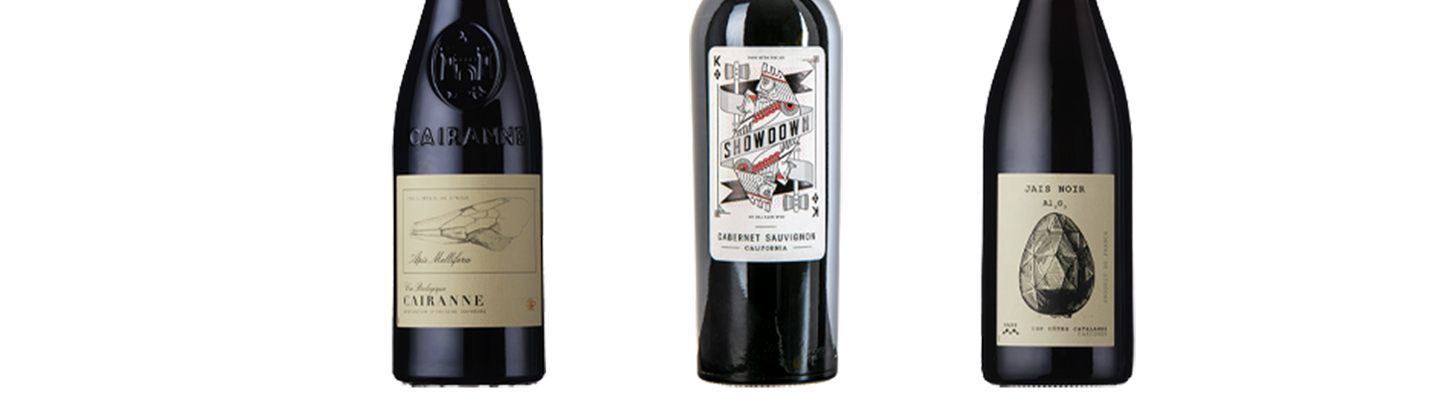
Showdown Man with the Ax is a WineCollective favourite.
Many of your wine labels stand out because they are funny. Humour is a great way to get noticed, of course, but how do you make sure it works internationally?
JR: “We think about the audience a lot, and in which environment the wines are going to be sold (restaurant, retail, etc.), but we try to stay relatively cheeky and light with our messaging. For us, humour is a way of making wine more accessible and less scary, which I think is a welcomed trend at the minute. However, once we decide upon a design, a name, etc, we always scope around the teams and some customers to make sure that it’s appropriate and still works as a concept.”
Besides humour, what are some of the other tactics to stand out on the crowded store shelves?
JR: “We recently started collaborating with fantastic artists that have a very clear vision of the world (that’s not necessarily associated with wine) and by mixing both art and wine, and it turned out phenomenal. So I would say we try to be bolder in our styles and colours.”
JH: “We also like to try and push the “standard formula” of a wine label. Even if we are presenting a more traditional wine, we try to see if there is an interesting way to lay out the typography or crop an illustration that will add some intrigue. Apis Mellifera, a new wine from Boutinot Rhône is a good example of this, where we decided to look deeper at our own brand – which we represented with a detailed illustration of a bee wing.
We also have great relationships with printers all over the world and our technical managers work hard to ensure our designs stand out with finishes and techniques that elevate the concept.”
Could you give us a few examples of label designs that resonated/stood out?
JR: “Oh there are so many! Here are a few:
Uva non Grata – an artistic label project working with several designers from different countries to encourage people to buy unknown grape varieties. It’s all about the grapes here!
Henners – a beautifully designed label for our English Home taking inspiration from the English countryside and beach coastlines.
Le Petit Bonbon – a lovely illustrated Boutique Window inspired by walks in Paris and traditional shops. The name reflects the fruitier character of the wine, tasting like a little strawberry treat.
Pablo y Walter – a colourful label, reflective of both the fantastic wine inside the bottle and the vibrancy of Mendoza. The handshake is representative of the great partnerships with winemakers and people in general.”
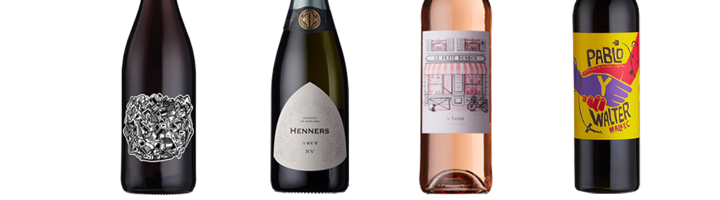
Uva Non Grata Gamay is a WineCollective favourite.
Feeling inspired by these designs? Go on and explore our WineCollective store, where we feature many bottles with great labels for every taste. And of course, it’s ultimately about what’s in the bottle. Our wine experts personally taste hundreds of bottles each month, to make sure our members receive a selection of fantastic wines delivered to their doorstep each month. Join us, and we’ll explore the world of wine together.